color management

How to Perceive Brightness More Accurately — CreativePro.com article

Are your prints too dark, or does your published work appear darker (or lighter) than expected? If so, you might benefit from making simple adjustments to your editing environment.

In my article on CreativePro.com, I explain how the way you perceive the brightness of your work depends on a combination of application settings, operating system settings, and display settings. To read the article click the link below:

How to Perceive Brightness More Accurately at CreativePro.com

How do P3 displays affect your workflow? — CreativePro.com article

Some new displays use a color space called P3, which is different than the sRGB and Adobe RGB color spaces that designers and photographers have used for years. Is P3 an improvement, or a complication? I answer that question in an article I wrote for CreativePro.

Read my article at the following link:

How do P3 displays affect your workflow?

That article refines the observations about P3 displays that I originally explored in an earlier article on this blog, A look at the P3 color gamut of the iMac display (Retina, Late 2015). I wrote the earlier article when Apple first starting shipping P3 display built into the Late 2015 iMac. Today, Apple includes P3 displays in their top-of-the-line iMacs, MacBook Pros, iPhones, and iPad Pros.

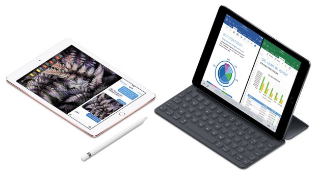
9.7-inch iPad Pro

iPad Pro 9.7 inch and iOS 9.3: Color management progress

The 9.7-inch iPad Pro and iOS 9.3 demonstrate that Apple is gradually implementing color management in iOS, and has made it available to developers. While the presence of color management isn’t obvious on the surface, Apple has added multiple new features that would typically depend on color management.

(more…)

A look at the P3 color gamut of the iMac display (Retina, Late 2015)

iMac 27
The Late 2015 Retina iMac includes the first wide gamut display that Apple has made for a Mac, able to reproduce colors well outside the sRGB color gamut. I had questions about the P3 color gamut of the new iMac, so I went over to my local Apple Store to check it out.

Up to this point it’s been a conscious choice to buy a wide gamut monitor. I made that choice when I connected a wide gamut NEC PA272w to my Mac Pro. But now the P3 display is built into all of the new 4K and 5K Retina iMacs, so Retina iMac buyers will now be working with a wide gamut display whether they know it or not. While using a wide gamut monitor is generally a good thing, it can involve certain color challenges.

(more…)

Choosing a Display for Photography and Design — Peachpit.com article

When you buy a new monitor for photography or design, what features should you look for? Should your next monitor be a 4K or wide gamut display? In an article I wrote for Peachpit, I help you understand the alphabet soup of display terminology so that you understand which features are actually important to a creative professional. I discuss features that affect color reproduction quality, and why some monitors cost a lot more than others.

Click the link below to read the article at Peachpit.com:
Choosing a Display for Photography and Design

Choosing a Display for Photography and Design on Peachpit.com