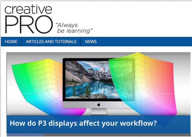
Some new displays use a color space called P3, which is different than the sRGB and Adobe RGB color spaces that designers and photographers have used for years. Is P3 an improvement, or a complication? I answer that question in an article I wrote for CreativePro.
Read my article at the following link:
How do P3 displays affect your workflow?
That article refines the observations about P3 displays that I originally explored in an earlier article on this blog, A look at the P3 color gamut of the iMac display (Retina, Late 2015). I wrote the earlier article when Apple first starting shipping P3 display built into the Late 2015 iMac. Today, Apple includes P3 displays in their top-of-the-line iMacs, MacBook Pros, iPhones, and iPad Pros.

