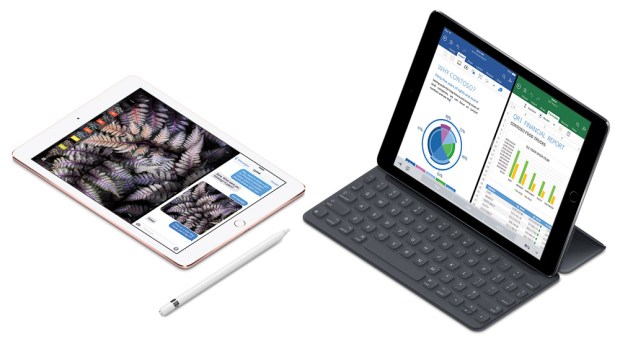
The 9.7-inch iPad Pro and iOS 9.3 demonstrate that Apple is gradually implementing color management in iOS, and has made it available to developers. While the presence of color management isn’t obvious on the surface, Apple has added multiple new features that would typically depend on color management.
Night Shift
Based on the findings of sleep studies, the new Night Shift feature in iOS 9.3 tries to make it easier for you to sleep after using an iOS device late at night by reducing the amount of blue light emitted from the display. Night Shift does this by changing the white point of the screen away from blue and toward yellow.
This was an early clue for me that iOS was implementing color management. In OS X, the software f.lux can already perform the same kind of display white point adjustment that’s based on the time of day. f.lux does it by applying a custom display profile — you can see this in the Displays system preference in OS X. If Apple implemented Night Shift on iOS the same way f.lux does it on OS X, that suggests iOS 9.3 has some level of support for a display profile that can be manipulated.

In OS X, f.lux software works by manipulating the display profile. Night Shift may work in a similar way.
True Tone display
The 9.7-inch iPad Pro includes a new feature that Apple calls the True Tone display. Apple says it uses “advanced four-channel ambient light sensors to automatically adapt the color and intensity of the display to match the light in your environment.” The point is to reproduce what happens when you carry a piece of white paper around all day long: Whether you notice or not, the apparent color of the paper constantly shifts to reflect the color and brightness of the ambient light, from normal daylight to relatively yellowish or greenish artificial light.

This Apple graphic illustrates how the True Tone display adapts to match ambient lighting conditions.
Because an iPad screen works by emitting its own light, it can’t reflect ambient light like a piece of paper can. What the True Tone display does instead is use the iPad light sensors to make the color and brightness of the iPad display’s emitted light match the ambient light. It’s a curiously elaborate way to reproduce what happens in the natural world with no batteries.
The white point change of the True Tone display appears to be conceptually similar to how the Night Shift feature works, and that’s why I’ve assumed the True Tone display came into existence in part because there is now a foundation for color management in iOS 9.3.
DCI-P3 display
Another new feature of the 9.7-inch iPad Pro is that its display is claimed to cover the DCI-P3 color gamut. In terms of color gamut size, that display puts the 9.7-inch iPad Pro in a class above most other mobile devices and all other iOS devices. As I noted in my article A Look At The P3 Color Gamut Of The iMac Display (Retina, Late 2015), DCI-P3 is so much larger than the conventional sRGB color space that color management is essentially required to maintain color consistency for objects that have always assumed a display would be close to sRGB, as well as for objects tagged with other color spaces. Using a DCI-P3 display was another clue that iOS now contains a standard color management infrastructure.
Developer notes emerge
Up to this point I was only guessing that there was a color management system in place in iOS. Then Jeff Carlson reported on Twitter:
Very cool, from last night: ColorSync Support in iOS 9.3 (!) https://t.co/cmDqD91Gqn
— Jeff Carlson (@jeffcarlson) March 24, 2016
The tweet links to a post on Jeff’s blog, which refers to a Twitter conversation that confirmed color management is in place in iOS 9.3.
@jeffcarlson @reneritchie @asymco Yes it’s completely open to other apps, but it’s not very well documented yet. https://t.co/CXgh9gy4ZQ
— Craig Hockenberry (@chockenberry) March 24, 2016
It’s official, and I don’t have to wonder any more: Apple has in fact added support for color management in iOS 9.
[Update: Craig Hockenberry has now written a very interesting and more technically grounded article about iOS color management: Looking at the Future]
Almost there…
If you consciously use color management on your OS X or Windows computer, the current implementation in iOS 9 may not yet meet all of your expectations or needs. While there are now iOS 9.3 features that use color management and Craig Hockenberry’s tweet says that color management is “completely open to other apps,” as far as I know you can’t yet do things like install your own ICC profiles, connect and run a display profiler, soft-proof, or use the equivalent of the Assign Profile or Convert to Profile commands in the desktop version of Photoshop. Right now it isn’t clear how quickly Apple plans to have iOS support the same level of color management as OS X and Windows, or even if Apple intends to support color management that far on iOS.
But the appearance of color management in iOS is still a welcome development. At the very least, it provides a way for color reproduction on iOS devices to be potentially more reliable than on devices running other mobile operating systems.
Many may not accept this until it’s possible to create a custom display profile in iOS, but displays have matured. LED-backlit displays don’t drift as quickly as CRT or CCFL-backlit displays used to, and iOS devices may be using display circuitry that compensates for age (some desktop displays have this feature). Apple may feel that they can keep the iPad Pro display stable enough so that the factory-installed display profile, together with a color management system, provides color rendering that’s reliable enough for most purposes and acceptable for photo editing.
It will be interesting to see how quickly iOS apps take advantage of the color management foundation that Apple has added to iOS.


interesting article, important topic.
I make designs on the ipad which I transfer to the mac for enlargement and prepress. So I have two color translations, from ipad to mac and from mac to external printer. The one from ipad to mac I do manually. It takes a lot of time and is never entirely satisfactory. Would you know if there exists a color profile that you can install on the mac, that enables you to see the colors as they are on the ipad? Thank you.
Hi Pauline, how do you transfer the iPad images to your Mac? The reason I ask is that if they come into the Mac with an embedded color profile, the colors should be fine; but if they come into the Mac without an embedded color profile then you’ll have to assign one first. To find out if you need to do that, do the following first:
Open one of your iPad images in Photoshop. Look to the right of the magnification percentage near the bottom left corner of the document. There’s a rectangle that probably says “Doc:” and some numbers. Next to that on the right, click the > and choose Document Profile from the menu that pops up. Choosing Document Profile should make that box display the name of the iPad image’s embedded color profile, reply here with that because I’m curious what it is. It would tell me what you should try next.
Dear Conrad, thank you, and excuse my delayed reply. The document has the sRGB IEC1966-2.1 embedded.